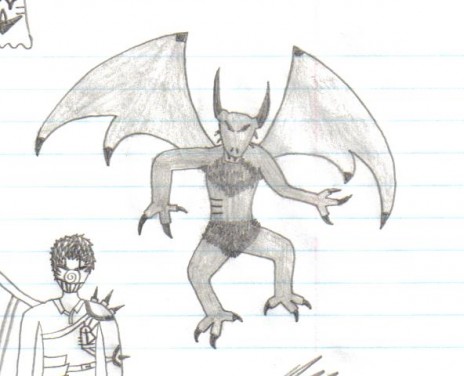
Well, Unfortunately I have reached my limit for art submissions so you won't be seeing much new for a little while, but I'd still like to see some critisism on my work! My comic is also still on the way but it looks like I may not be able to post it here :\
Hopefully I'll be able to get something arranged but for now nothing new, sorry :| Hope people still enjoy my art :) Also, when I say critisism I do mean serious ways I can improve! So please do make sure comments are sensible, reviews saying it's good would be nice but I'm hoping mostly to hear ways to improve.
Also, since I can't post it in the art portal yet, I'll post it here :D
Comments for drawing-the focus is the demon, unfortunately it was on a page cluttered with drawing but I still think I did a really good job :3 Hope you all enjoy!

TheEntertainer
When drawing, it's important to understand foreshortening and depth of space. Your designs are good, and you seem to know how to shade, so let me help you out with some tips:
Foreshortening: When you want things to look like they are coming forward, make them gradually get wider (for example, an arm that you want to reach toward the viewer starts at it's propertional or "right" size at the shoulder, then the arm slopes wider until the hand, at the end of the arm, looks significantly larger than the rest of the body). This also works in the opposite direction(hand is small, arm slopes inward)
Depth of field/space: here are a few rules to try:
1. Larger or closer things take up more space.
2. Closer things are closer to the bottom of the page.
3. Things with darker shading appear farther away.
Sorry for giving you so much to read :/
Hope to see improvement! :D